Proliphix makes several different kinds of hard-wired IP enabled thermostats for home and industrial use. This page describes the thermostat-graph package which enables the generation of real-time RRDTool graphs by accessing the Proliphix API over the network. For example, a typical graph from a n10e thermostat might look like this:
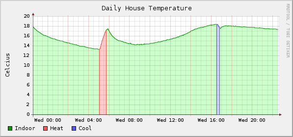
In this example, the green line represents the indoor temperature as sensed by the Proliphix. The red area corresponds to the time when the heat was on and the blue area corresponds to times when the air conditioning was on. Weekly, monthly and yearly versions of the same graph are available and you can get the graphs in Fahrenheit or Celsius. This view gives you a quick visual snapshot into how much energy you are consuming and what you are getting in return.
The n20e model optionally supports an additional two temperature sensors. If you use one of those sensors for the external temperature, you can overlay the external temperature to get a better picture of the efficiency of your house.
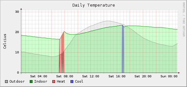
In this example, the grey line represents the outdoor temperature which gives a clear indication of the temperature differential between outside and inside. When the temperature differential is extreme, the energy required to change the temperature one degree may be far more than when the temperature differential is less drastic.
This project is under active development and considered beta code at this point. Please download and try the package and let me know comments and suggestions.
Requirements
-
perl
- LWP module
- URI module
- Date::Calc module
- RRDTool
- cron (or some other utility that can run thermostat-graph regularly)
- Proliphix n10e or n20e IP Thermostat (other models not yet tested)